WEEK 4 - IMAGE AS PERSUASION
By Caylen Burger


For our week four task, we looked into how to use persuasion within our art and images to convey our message and claim in a more effective way for a viewer.
When doing this, it is important to use persuasion in conjunction with other design aspects to capture the audiences attention and hold it. You can do this by using things like the golden section and rule of thirds to have your piece look harmonious and draw the eye where you want it to be, and utilising the empty space to ensure you keep your subject as the main focus.
I am doing my images on ocean pollution, and wish to convey the detrimental impacts it has on our marine biodiversity.
TARGET AUDIENCE:
My target audience will be young adults and adults - ranging from 20 - 25 high SES.
By deciding on my target audience, I could ensure I kept my piece relatable enough that it would hold their attention and hit them close to home, hopefully inspiring change in the way the new generation treats our planet.
SKETCHING:
I began mind-mapping what I wanted my three iterations to look like. I started off by sketching different things from keywords that reminded me of ocean pollution and key visuals to go with it.

For my mindmapping, I used a fineline pen as my medium to do quick sketches of key ideas that I could develop on. I ended up choosing the earth, operation game, drink up, and trashion week sketches to further develop.
POSTER CONCEPTS:
I ended up doing four poster concepts so I could maximise my choice and see what would be the most persuasive for my target age group.
POSTER CONCEPT #1 - TRASHION WEEK

Medium: Procreate HB Pencil
For this concept, I wanted to play into the consumerism culture of modern generations by creating a "Trashion Week" poster, which is a play on New York Fashion week. Since it is such a major event, especially among young celebrities, I feel like this could spark them to speak out on these issues, which would then help influence their fans - those who would be around the same age. I wanted to showcase some popular sea creatures dressed in trash couture with the poster similarly styled to a fashion magazine. I really wanted to focus on the composition here to make sure the sea creature in trash is the clear subject. I wanted to convey a satirical message by having text like "killer style", which helps persuade through humour. I made sure to follow rule of thirds, by having my subject directly in the center, with text framing it and adding to the message.
POSTER CONCEPT #2 - OPERATION

Medium: Procreate HB Pencil
For this piece, I wanted to persuade through satire/comedy by hitting the audience closer to home through a childhood game, while also relating it to how pollution kills marine biodiversity through this seagull. I wanted it to be styled similarly to the actual operation board game, with the only difference being the bird with plastic trash in the stomach pockets.
POSTER CONCEPT #3 - DRINK UP
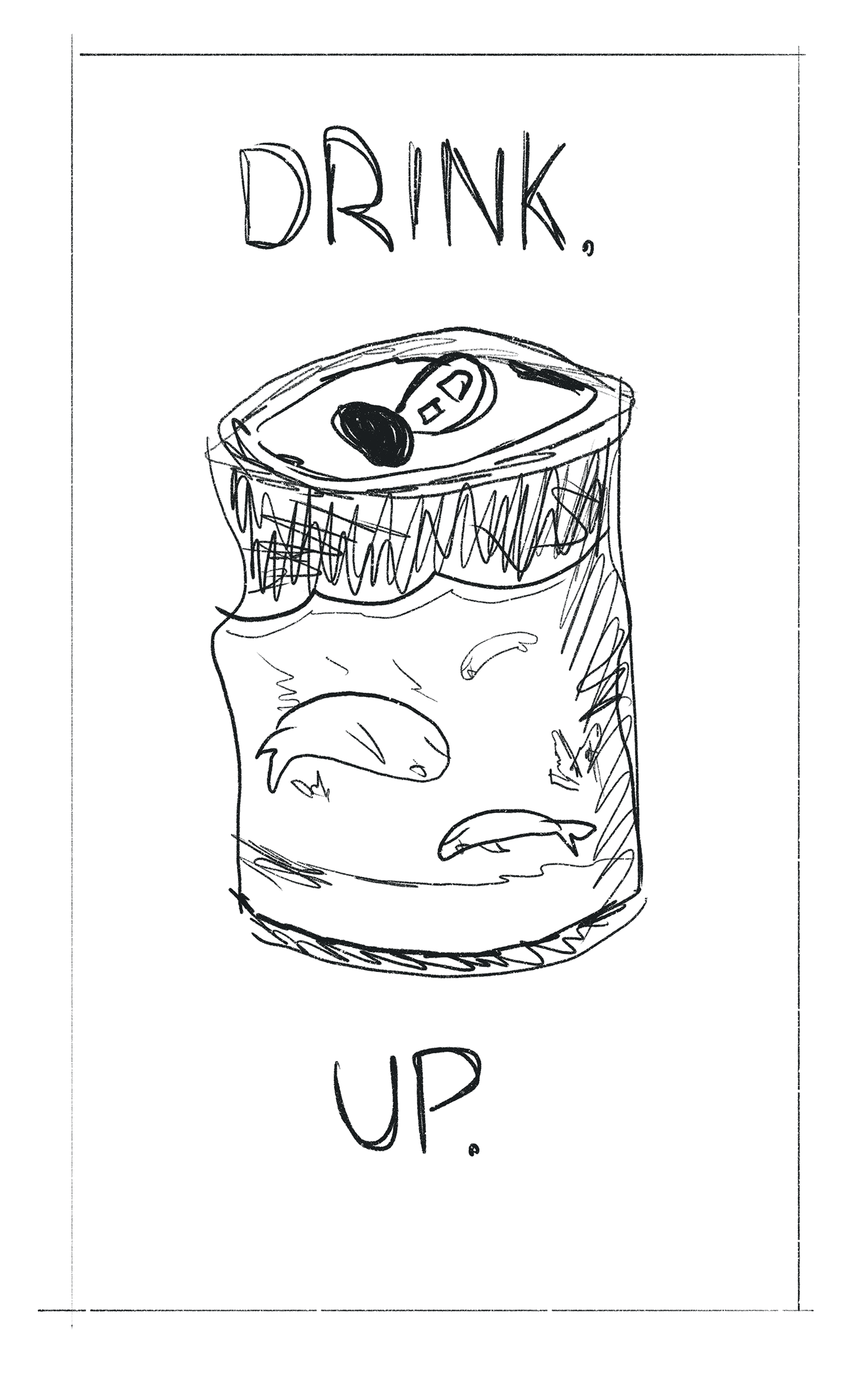
Medium: Procreate HB Pencil
For this concept, I wanted to go a bit simpler and be harder hitting with the message. I decided to create a crushed soda can with dead fish inside, as though they are swimming in a dirty ocean. I put text that reads "drink up" as though calling out the audience and forcing them to face the consequences by drinking in the impact they have on the environment.
ADDITIONAL POSTER CONCEPT #4 - CIRCLE OF LIFE

Medium: Procreate HB Pencil
For this additional concept, I wanted to create a Circle of Life piece that shows how the pollution of the city devastates the ocean. I wanted to leave the text out and keep the subject in rule of thirds for the composition so it can wordlessly persuade the audience to stop polluting our seas. This is also particularly impactful as it can reach audiences beyond the target and even those who may not speak english as the picture is universally readable.
REFINING STAGE OF POSTERS
For the refining stage, I decided to develop the trashion week concept and create it into a illustrative series.


For the images, I wanted to persuade the audience through humour, similar to my previous concept sketches. I created a gruesome subject of a sea creature that has died through plastic cutting into them, but looking like they're wearing couture. I softened this image slightly through satirical text like "to die for" and "trashion week" to help the audience digest the piece. I wanted these images to be provoking but not hard to look at, since it would defeat the purpose of persuasion - to appeal to the audience.
For all three posters, I used a Procreate HD pencil as my medium to sketch out the main sections of the poster and workout my layout and composition of the piece.
FINAL POSTERS (VERSION 1): The Trashion Week series


Medium: Procreate using technical pen.
For my process, I used real sea creatures and referenced the layout of Vogue Magazine to help me with the layout of the piece and ensure it maintains the rule of thirds and golden ratio. I wanted to use primary colours in this piece to help standout against the black background, keeping the focus on my subject. I also highlighted specific parts of the text that relate to the subject like "die" and "killer style" to help clearly convey the message the ocean pollution kills, subtly. I then added a place holder for a QR code that would link to an Ocean Conservation source to encourage people to read more about ocean pollution and how to help solve this devastating issue.
FINAL POSTER CONCEPTS (VERISON 2 - COLLAGE):


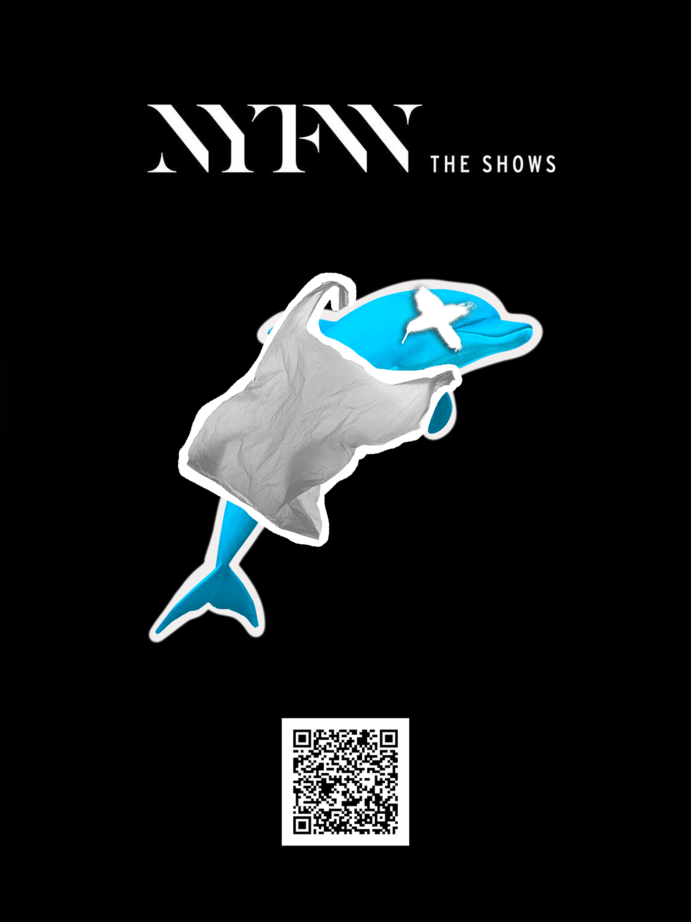
Mediums: Photoshop and Procreate
For my final collage series, I created a similar primary colour series that features sea creatures wearing trash couture. To pay homage to collages, I added white borders around each layered image to help them look like they've been cut out of a magazine. I wanted to keep this greyscale with the exception of the sea creatures as I wanted them to be the only life and soul of the piece. This helps convey my message that trash drains our oceans of colour and life. Since I am basing this off popular fashion magazines, I wanted to use their logos and "avant garde" style of their posters to really draw attention to my message. I also added a QR code at the base of each poster that directly takes any scanners to an article about The Ocean Cleanup, an organisation that helps clean our oceans and helps our marine biodiversity. By keeping these poster plain with bold, primary colours, I have created a statement poster that will catch the eyes of my target audience.
REFLECTION:
For both sets of images, I knew I wanted the main focus to be on my message that ocean pollution destroys our marine life. For the first series of final posters, I wanted the illustrations to be colour-focused with eye-catching primary colours that would attract the audience through its familiarity. I also wanted to create red pools of blood that lead your eye down to the text "to die for" to show the audience how trash kills and shreds the bodies of marine life, creating a sense of sadness and shock. By having a plain black background, I can maintain the audience's focus on the text and subject matter, ensuring that they are forced to stare at the tragic state of the sea creature. While the humour is designed to soften the blow of the image, I have still used colour to subtly create guilt by highlighting words like "die", "killer", and "trash" in blood red to keep the message clear.


